Building expressive design systems with Material Design 3 in Webflow
Can you create expressive design with Webflow using Material Design 3?
Yes. Webflow supports expressive design by aligning with Material Design 3's principles through visual controls, variables and animations. Here's how:
- Use variables as design tokens
- Style components with MD3’s soft aesthetics
- Add motion with scroll and state interactions
- Build responsive layouts using CMS
- Create theme variations for personalization
What is expressive design and why MD3 changed the game
The world of digital design has undergone a dramatic shift. In 2021, Google introduced Material Design 3 (also known as Material You), representing a "radical new way to think about design" that moved away from rigid uniformity toward genuine personalization and expressiveness.
As Matías Duarte, Google's design lead, noted, the old material metaphor had become "consistent... but a little stale, boring, too tied to a modernist same-ism." Material Design 3 addressed this by creating interfaces that feel alive, responsive and uniquely personalized to each user.
The core principles of expressive design from Material Design 3
What exactly is expressive design? At its core, expressive design creates user interfaces that adapt to user preferences, respond intelligently to interactions and feel dynamic rather than static. MD3's goal is to help designers "create designs that are personal for every style, accessible for every need, alive and adaptive for every screen," reintroducing creativity and individuality into app experiences.
This leads us to a crucial question many designers and developers are asking: can Webflow support this kind of modern design system? Can a no-code platform deliver the sophisticated, adaptive experiences that Material Design 3 envisions?


Material Design 3 introduces several foundational concepts that define truly expressive design:
Dynamic color
The most visible innovation in MD3 is its approach to color. Rather than enforcing a single color palette across all users, dynamic color enables user-driven themes that can adapt to preferences, accessibility needs, or even extract colors from a user's wallpaper or profile image.
Dynamic color works through an algorithmic theming system that extracts a color palette from user content and applies it throughout the UI. If the content changes, the UI colors change to match. Creating a uniquely personal experience while maintaining accessibility and visual coherence.
Tokens
Design tokens serve as the backbone of Material Design 3, replacing the old style of defining static theme attributes. These tokens are essentially named variables for all design properties (colors, typography, spacing, etc.), which enable a more systematic and cross-platform theming approach.
Google defines design tokens as representing "the small, repeated design decisions that make up a design system's visual style and replace static values with self-explanatory names." They serve as a single source of truth that can be used in both design tools and code, making it easier to keep colors and styles consistent across an entire interface.
Motion and states
Material Design 3 emphasizes soft shapes, meaningful interactive feedback and smooth transitions. The updated motion system creates interfaces that feel more approachable and responsive.
Components feature more expressive animations during state changes. For example, switches, checkboxes and radio buttons were completely redesigned with new motion effects. Active states for navigation items now use filled icons and contrasting pill-shaped indicators, making the experience more visually engaging.

Expressive Typography
Material Design 3 introduces a significant evolution in typography approach with its Adaptive Type Scale. Instead of using fixed point sizes across all devices, MD3 organizes typography into categories (small, medium, large) that can dynamically scale based on screen size and user preferences.
This marks a shift from Material Design 2's static typography to a more flexible system. Text styles in MD3 use sentence case by default (rather than all caps for buttons in MD2), creating a friendlier, more approachable reading experience. The type scale is designed to maintain proper hierarchy and readability across devices while allowing for personalization. Typography in MD3 works hand-in-hand with the color system to ensure sufficient contrast and accessibility, with text styles that respond appropriately to light and dark themes. This adaptive approach ensures text remains legible and properly proportioned whether on a phone, tablet, or desktop display.

Adaptive layout guidance
Modern interfaces must function flawlessly across countless device sizes. Material Design 3 is "adaptive by default," providing comprehensive guidance for creating layouts that adapt intelligently to different screens.
MD3 introduces "Compositions". Which are layout templates optimized for different device types, including tablets and foldables. For example, a List/Detail composition shows a list of items on one side and the details panel on the other, perfect for email or messaging apps on larger screens.
Together, these elements create experiences designed to feel "alive, personal and coherent". The core promise of Material Design 3's expressive approach.

Expressive design in Webflow: what's possible?
The good news for designers and developers is that Webflow offers robust capabilities for implementing Material Design 3 principles. Here is what makes Webflow uniquely suited for expressive design:
Visual control
Webflow provides precise control over fundamental design elements including layout, typography, color and border radius. This control allows designers to implement Material Design 3's softer, more playful aesthetic without compromising on details.
You can easily create the more rounded shapes and varied corner radii that characterize MD3 components. Buttons, cards and other elements can be styled with the larger corner curves that give Material Design 3 its softer look.
Webflow Components
Components in Webflow function similarly to symbols in design tools, allowing for reuse, variants and overrides. This component-based approach aligns perfectly with Material Design's emphasis on consistent, reusable elements that maintain coherence across an interface.
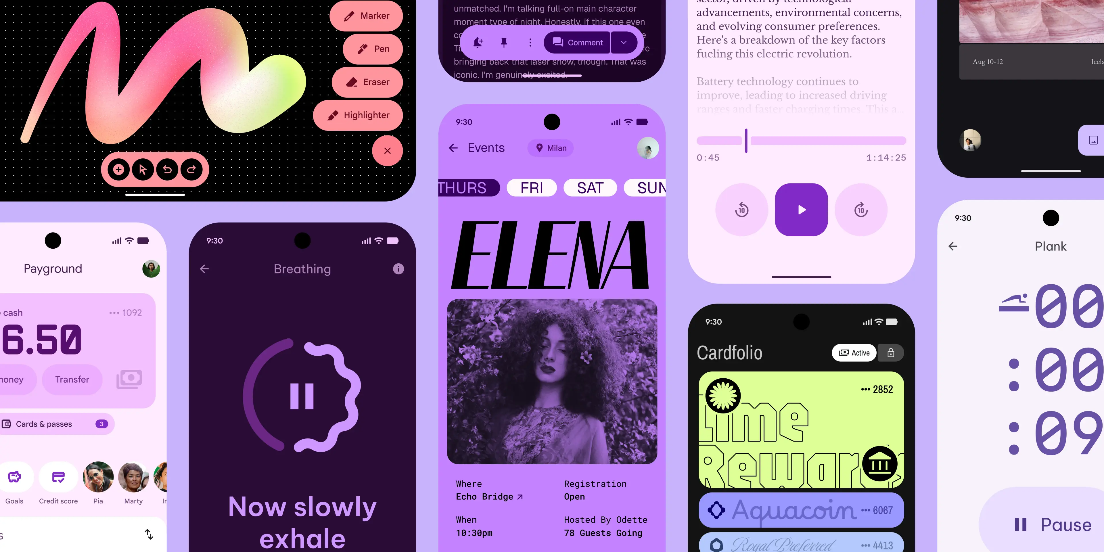
With Webflow Components, you can create Material Design 3's reimagined components like the updated button styles (Filled, Filled Tonal, Elevated, Outlined and Text), the three types of Cards (Elevated, Filled and Outlined) and the expanded family of navigation components.
Variables
Webflow's native support for variables provides the foundation for design system logic. These variables can store colors, spacing values and typography settings. Functioning almost identically to design tokens in Material Design 3.
This token-based approach is crucial for implementing MD3's dynamic color system. By storing color values as variables, you can create theme variations that can be easily swapped, simulating the personalization aspects of Material You.
GSAP-style Interactions
Perhaps most importantly for expressive design, Webflow offers sophisticated animation capabilities without requiring code. Designers can create scroll-triggered animations, hover states,and microinteractions that bring interfaces to life in the Material Design spirit.
This allows you to implement MD3's emphasis on meaningful motion and interactive feedback. You can create the softer, more expressive animations for state changes, transitions between screens and scroll-based reveals that make Material Design 3 interfaces feel responsive and alive.
These capabilities make Webflow an excellent choice for bringing expressive design to marketing sites and product websites that want to incorporate Material Design 3 principles without the complexity of custom development.
Real life examples of expressive design in Webflow
- FC088 by Dennis Snellenberg


- Sugar by Dennis Snellenberg


How to create an expressive design in Webflow
Building a Material Design 3-inspired system in Webflow requires thoughtful planning. Here is a systematic approach:
Use Webflow Variables as tokens
Start by establishing your design tokens as Webflow Variables. Create color variables that reflect Material Design 3's tonal palettes with roles like primary, secondary, tertiary and neutral.
For a fully MD3-compliant approach, create light and dark theme variants for each color role. This gives you the foundation for theme switching and adaptive coloring that's central to Material Design 3.
Define spacing variables that follow Material Design's 8px grid system. Set up typography variables for MD3's adaptive type scale, which organizes typography in categories (small, medium, large) rather than fixed point sizes.
Create a style guide page
A dedicated style guide page serves as both documentation and testing ground. Here, display all components, color variations, typography settings and spacing examples.
In your style guide, include all the updated MD3 component styles: the various button types, card styles, navigation elements and form controls. This becomes invaluable as your design system grows in complexity.
Connect Components to Variables
When building Components, connect them to your variables instead of using hard-coded values. This ensures that when you update a variable (like your primary color), all components using that variable will update automatically providing the systematic control that Material Design 3 requires.
For example, create button components that use your color variables for their backgrounds, border and text. When you update the primary color variable, all buttons using that variable will update instantly. Similar to how design tokens work in the MD3 system.
Theme variations
Webflow makes it remarkably easy to implement theme variations. By switching variable values, you can create light and dark modes or completely different brand variations across pages.
While Webflow can't automatically extract colors from user wallpapers like Android 12+ does with Material You, you can create preset theme options that users can choose from, giving them a sense of personalization and control over the interface.
Systematize expressive design
The key to success is establishing a consistent system. Define clear rules for how components behave, when animations occur and how layouts respond to different screen sizes.
Follow Material Design 3's more playful aesthetic by using softer shapes, more rounded corners and tonal variations instead of heavy shadows for visual hierarchy. Implement MD3's updated visual style with flatter surfaces that use color instead of elevation for distinction.
Leverage CMS for structure
Webflow's CMS capabilities provide structure for dynamic content, allowing you to maintain design integrity even as content changes. This separation of content and presentation aligns with Material Design's component-based approach.
Use CMS collections to manage content that will be displayed through your MD3-inspired components, ensuring consistency across varying content types and lengths.
Implement thoughtful interactions
Use Webflow's interaction capabilities to add meaningful motion that guides users and provides feedback. Focus on transitions between states, scroll-based reveals and subtle hover effects that make the interface feel responsive.
Create animations that match Material Design 3's softer, more expressive approach. For example, implement the pill-shaped active state indicators for navigation items, or the subtle expansion and color changes for buttons on hover.
When and why to use Webflow for Material-style design
Webflow particularly excels for certain Material Design 3 applications:
Expressive, theme-driven marketing sites
Marketing sites that need to convey brand personality through adaptive design, thoughtful motion and cohesive visual systems are perfect candidates for a Webflow implementation of Material Design principles.
By applying MD3's softer aesthetic and focus on color for hierarchy, marketing sites can create more engaging, modern experiences that feel less rigid than traditional Material Design implementations.
Product landing pages
For products that follow Material Design in their applications, creating landing pages with the same design language creates consistency between marketing and product. Webflow makes this achievable without developer resources.
You can implement MD3's responsive layouts and adaptive components to ensure your product landing pages look great on all devices from phones to tablets and desktops.
Website versions of design systems
Organizations with existing Material Design systems can use Webflow to create web documentation that demonstrates components in action rather than just displaying static examples.
This is particularly valuable for showcasing the dynamic aspects of Material Design 3, like state changes, motion and responsive behaviors that static documentation can't adequately represent.
Startups prototyping interfaces
For startups exploring Material You-inspired interfaces, Webflow provides a visual development environment where designs can be rapidly tested and refined before committing to custom development.
The ability to quickly implement MD3's updated component styles, color systems and responsive layouts makes Webflow an excellent prototyping tool for Material Design 3 concepts.
Conclusion: is Webflow good for expressive design systems?
Yes. Webflow is a great tool for implementing expressive design systems inspired by Material Design 3. It provides all the essential capabilities: Components for consistency, Variables for systematic control, sophisticated motion tools and responsive layout options.
While Webflow can't replicate every aspect of Material You (like extracting colors from user wallpapers automatically), it can implement the most important principles: the token-based design system, the updated visual style with softer aesthetics, the emphasis on meaningful motion and the adaptive layouts for different screen sizes.
The key to success lies in planning. By establishing a clear design system foundation with well-defined variables, components,and interaction patterns, Webflow can deliver flexible, scalable and modern UI experiences that embody the spirit of Material Design 3's expressive approach.
As Material Design 3 continues to evolve (with extensions like "Material 3 Expressive" already expanding the system), Webflow's flexibility makes it well-positioned to adapt to these changes, ensuring your design system remains current and effective.
Need help building your expressive design system in Webflow?
Let's talk about how we can bring Material Design 3's principles to your next project.

I blend my design vision with technological expertise to help your service business improve its online appearance.

Answers to your questions
Check out the FAQ or book a 30 minute call to answer your questions and figure out your next step!
Is Webflow good for expressive design?
Yes. Webflow is a powerful tool for expressive design. With visual control over layout, motion and theming through variables, it lets you build dynamic websites that feel personal and polished. It's especially effective for designs inspired by Material Design 3.
What are Webflow variables and how do they help with design systems?
Webflow variables are reusable values for things like color, typography, spacing and corner radius. They function like design tokens, helping you build a consistent design system. When you update a variable, it applies across all instances.
Is Webflow only for simple sites or can it handle structured design systems too?
Webflow is more than just a tool for simple sites. With components, variables and powerful animation tools, it's capable of supporting structured, theme-driven design systems. It’s ideal for marketing websites, product pages and visual design system documentation.